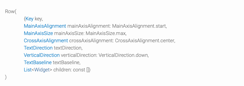
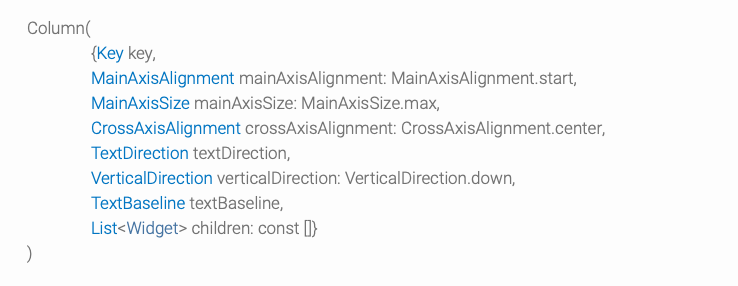
Row와 Column의 생성자는 아래와 같다.
Row는
Column
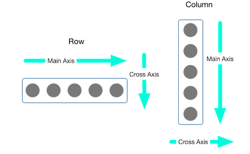
Row, Column의 children 들의 정렬
MainAxisAlignment및 열거 CrossAxisAlignment 형은 정렬을 제어하기 위한 다양한 상수를 제공한다.
- 행(Row)의 경우 주축은 가로를 기준
- 열(Column)의 경우 주축은 세로를 기준
- center
- start
- end
- spaceAround
- spaceBetween
- spaceEvenly
- baseline
- center
- start
- end
- stretch
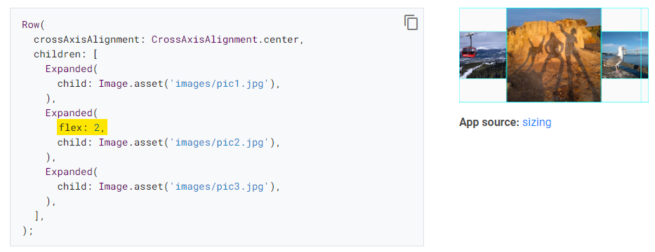
확장 위젯을 사용하여 Row나 Column에 맞게 위젯의 크기를 조정할 수 있다.
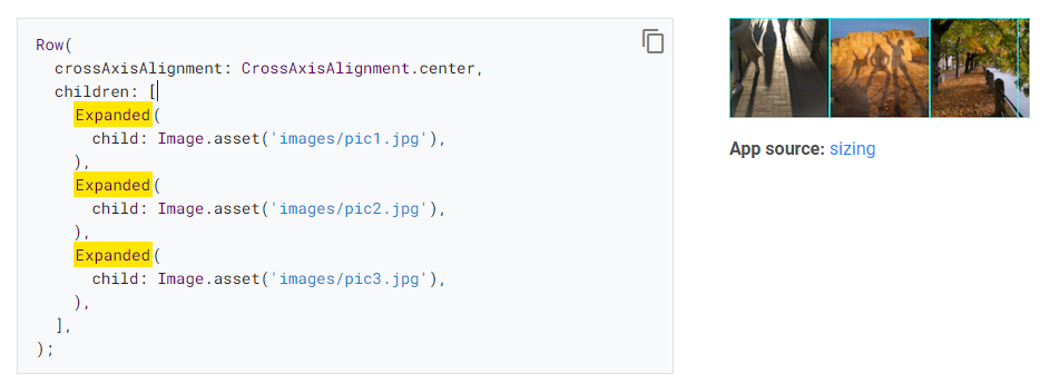
특정 위젯이 다른 children 보다 두 배의 많은 공간을 차지하게 할 수 있다.
위젯의 flex 요소를 결정하는 정수인 flex factor를 사용하면 된다. (기본값은 1)
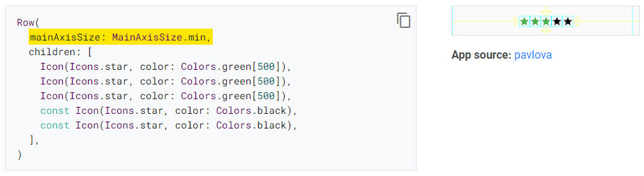
기본적으로 행 또는 열은 주축을 따라 가능한 한 많은 공간을 차지한다. 그러나 각 children 들을 묶으려면 mainAxisSize를 MainAxisSize.min으로 설정하면 된다.
좀 UI를 꾸며보자
이전 포스팅에서 말했던 것과 같이 이런 느낌으로 진행해보겠다.
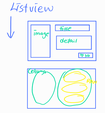
큰 ListView.builder 안에 Column-1에는 image, Column-2에는 text들!
Column-2에는 Row를 총 3개로, title-detail-heart count 순으로 진행할 것이다.
맨밑의 Row는 flutter에서 row 위젯의 가로 정렬할 때에는 mainAxisAlignment 인자를 사용하는 거를 인지해주자.
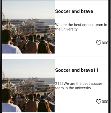
이전에 ListView만 적용시키고, 기본 widget만 추가한 UI 이다.
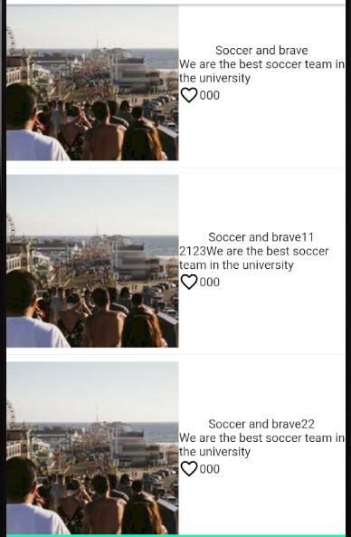
1. 텍스트들이 떨어져 있었으면 한다.
Row와 Column의 정렬
가운데 정렬
mainAxisAlignment: MainAxisAlignment.center왼쪽 정렬
mainAxisAlignment: MainAxisAlignment.start오른쪽 정렬
mainAxisAlignment: MainAxisAlignment.end양옆으로 적당히 정렬
mainAxisAlignment: MainAxisAlignment.spaceEvenly양옆으로 조금 넓게 정렬
mainAxisAlignment: MainAxisAlignment.spaceAround양쪽 끝으로 정렬
mainAxisAlignment: MainAxisAlignment.spaceBetweencrossAxisAlignment: CrossAxisAlignment.center //세로축 기준으로 중앙정렬
crossAxisAlignment: CrossAxisAlignment.end //바닥쪽으로 정렬
crossAxisAlignment: CrossAxisAlignment.start //위쪽으로 정렬
Column에는 아래와 같이 정렬을 시켜줬다.
MainAxisAlignment.spaceEvenly또, 맨 아래에는 Row (children = Icon , Text) 를 추가해서
mainAxisAlignment: MainAxisAlignment.end,속성을 지정해주었다.
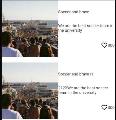
2. 오른쪽의 텍스트들의 강약의 표현이 확실히 되었으면한다
TextStyle을 적용해주었다.
Text([텍스트 내용],
  style: TextStyle(fontWeight: FontWeight.bold,
      fontSize: [텍스트 폰트]),),
3. 여백 넣기
padding은 내부, margin은 외부 면에 여백을 주는 것이다.
| padding type | 설명 |
| EdgeInsets.all([int]) | 모든 외부 먄에 5픽셀 여백 |
| EdgeInsets.fromTRB(left, top, right, bottom) | left, top, right, bottom 각 위치별 |
| EdgeInsets.only(left:[int], right:[int]) | left, top, right, bottom 각 위치별 여백 지정 |
| EdgeInsets.symmetric(vertical:[int], horizontal:[50]) | 가로 세로 값 설명 |
| EdgeInsets.zero | 값을 주지 않는다. |
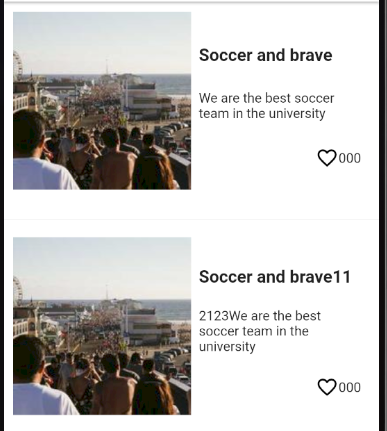
초기보다는 봐줄만한 UI가 완성됐다.
이제 저기에
- 이미지 자동 resize 되게, 사이즈 조정
- 텍스트 font size, 및 font에 관해 전역 theme 설정 진행
- 하트 클릭 시 icon 변경 및 숫자 카운트
- 클릭시 다른 페이지 구축
- 위에 필터 기능 추가
- 최상단에 검색 기능 추가
화이팅
'공부 > 플러터\Flutter' 카테고리의 다른 글
| [Flutter] Listview.builder 사용법 및 UI 구상 (0) | 2023.06.11 |
|---|---|
| [Flutter] FlutterSecureStorage 를 활용하여 로그인 상태유지, 로그아웃 (0) | 2023.05.23 |
| Flutter 기본 코드 (0) | 2023.03.14 |

